You are not logged in.
- Topics: Active | Unanswered
#1 2016-04-15 20:20:34
- mabra
- Member
- Registered: 2015-09-05
- Posts: 64
Looking for somethings which show my workspace title
Hello All !
I am using usually a good number of workspaces and each is full of windows.
So, if you hover the mouse over the small workspace window, you'll see an
application name the most time ...
I just remembered gnome, which has a small panel(item) for this. which shows
the desktop name near the selector. Is there anything I could do to make such
a best ? Oh - I do not have the extras installed - because I was not able to find
out, what ist therein.
Thanks anyway,
Manfred
Offline
#2 2016-04-15 22:22:17
- ToZ
- Administrator
- From: Canada
- Registered: 2011-06-02
- Posts: 12,552
Re: Looking for somethings which show my workspace title
If you hover over an empty area on the small workspace window, you'll see the name of the workspace.
You can also double-mouse click (or middle button / scroll wheel click) on the desktop to display the window list menu. This might also get you what you are looking for. Note that for the window list to display, you need to have Settings Manager > Desktop > Menus > "Show window list ....." enabled.
Mark solved threads as [SOLVED] to make it easier for others to find solutions.
--- How To Ask For Help | FAQ | Developer Wiki | Community | Contribute ---
Offline
#3 2016-04-16 00:45:54
- mabra
- Member
- Registered: 2015-09-05
- Posts: 64
Re: Looking for somethings which show my workspace title
If you hover over an empty area on the small workspace window, you'll see the name of the workspace.
You can also double-mouse click (or middle button / scroll wheel click) on the desktop to display the window list menu. This might also get you what you are looking for. Note that for the window list to display, you need to have Settings Manager > Desktop > Menus > "Show window list ....." enabled.
Ok, thanks. There is usually rarely empty area on the small windows ....
There is even no empty area on one of my desktops ....
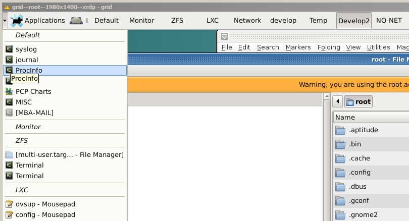
As a workaround, I use two panels, a top ordered horizontal one which contains a minimum of buttons, the desktop-switcher
the window-list (a button, which also contains the menu, you pointed out for the middle mouse button) and the app menu.
Then I have a vertical panel, auto-hide, with the task windows. This is really perfekt, compared to what I've used until now.
But, many times, I'll move a window to another workspace ... and nothing would by faster to have the name
of the selected workspace left/right beneth the selector
I just remembered from my other computer, that I selected to not display the miniture view - needed 29 mins.
to find it ... So I disabled it on this box too - a little sad for the minature view, but I'll keept it usually (too) small.
... Using the name instead of the miniature view forces yout to use short names for the workspaces ....
So currently, I live with the name instead of the small preview.
Thanks anyway for your help!
Manfred
Offline
#4 2016-04-16 01:14:44
- ToZ
- Administrator
- From: Canada
- Registered: 2011-06-02
- Posts: 12,552
Re: Looking for somethings which show my workspace title
How about adding the windowmenu plugin somewhere on your panel? This will also give you access to the window menu.
Mark solved threads as [SOLVED] to make it easier for others to find solutions.
--- How To Ask For Help | FAQ | Developer Wiki | Community | Contribute ---
Offline
#5 2016-04-16 02:30:48
- mabra
- Member
- Registered: 2015-09-05
- Posts: 64
Re: Looking for somethings which show my workspace title
How about adding the windowmenu plugin somewhere on your panel? This will also give you access to the window menu.
Exactly, that is waht I tried to describe with >the window-list (a button, which also contains the menu, you pointed out for the middle mouse button) <
It can have several forms of appearance.
I decided to show it as a button - so you'll see just a down arrow.
(Oh, my image does not appear - the link is right, but not https ...)
Regards,
Manfred
Last edited by mabra (2016-04-16 02:33:07)
Offline
- Registered users online in this topic: 0, guests: 1
- [Bot] ClaudeBot
[ Generated in 0.015 seconds, 7 queries executed - Memory usage: 529.42 KiB (Peak: 530.4 KiB) ]
