You are not logged in.
- Topics: Active | Unanswered
#1 2021-04-13 18:29:12
- Sadfa
- Member
- Registered: 2021-03-27
- Posts: 47
Dark on Dark - Thunar Icons in Panel almost invisible
This problem was first posted on the Manjaro forums because at the time I felt it was more applicable to Manjaro. However now I'm here because its now applicable to Xfce Thunar.
After a recent Manjaro update, the icons for Thunar for the Window Buttons of the Panel (and also in the top-left corner of Thunar's title bar), is dark by default. The Panel and Title Bars are also dark but default, so by default the Thunar icons are just not properly visible on Manjaro. I felt it's important that Thunar icons are distinguishable. In the ideal world there’d be a ‘Style’ select in Thunar’s Preferences > Display tab > Window Icon section with a dropdown list to select between (if you are running Papirus Maia?):
/usr/share/icons/Papirus-Maia/16x16/places/folder-black.svg (the current default the problem areas and when the icons are smallest in Thunar, by the way the latter is counter intuative)
/(…)/folder-blue.svg
/(…)/folder-bluegrey.svg
/(…)/folder-brown.svg
/(…)/folder-cyan.svg
/(…)/folder-deeporange.svg
/(…)/folder-green.svg
/(…)/folder-grey.svg
/(…)/folder-indigo.svg
/(…)/folder-magenta.svg
/(…)/folder-nordic.svg
/(…)/folder-pink.svg
/(…)/folder-red.svg
/(…)/folder-teal.svg (the current default for when icons are larger than 16px in Thunar)
/(…)/folder-violet.svg
/(…)/folder-yellow.svg
This might mean that many icons in the Papirus folder (/usr/share/icons/Papirus-Maia/16x16/places/) would need to be duplicated in the different colours. Also may require some kind of confluence between Xfce, Manjaro and Papirus(?).
Partial solution (to date) (TBC)
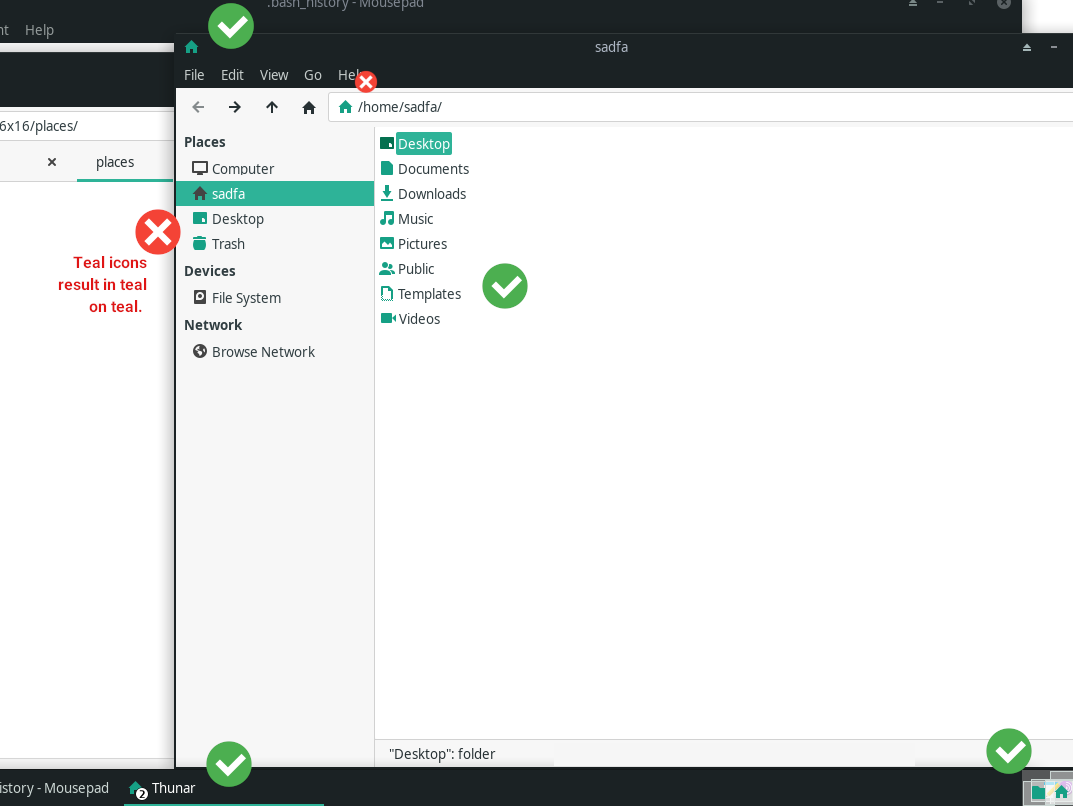
Not wanting to wait, I produced a hacky script to change the ‘color’ attribute of the SVGs. You can scroll down to see what this looks like, with the parts that are a bit bothersome having a cross near them and the things I’m happy with getting a tick.
mkdir -p ~/.local/share/icons/Papirus-Maia/16x16/places
cd ~/.local/share/icons/Papirus-Maia/16x16/places/

## You can replace folder-teal.svg with any of the colors in the folder.
ln -s /usr/share/icons/Papirus-Maia/16x16/places/folder-teal.svg ~/.local/share/icons/Papirus-Maia/16x16/places/folder.svg            ## For the folder icon in the main window (and unfortunately the icon in address bar and Side Pane)
ln -s /usr/share/icons/Papirus-Maia/16x16/places/folder-teal.svg ~/.local/share/icons/Papirus-Maia/16x16/places/inode-directory.svg   ## For the folder icon in the Panel and Title Bar

cp /usr/share/icons/Papirus-Maia/16x16/places/user-home.svg .             ## but unfortunately alters address bar, but not Side Pane, YAY
cp /usr/share/icons/Papirus-Maia/16x16/places/user-desktop.svg .          ## but unfortunately alters address bar AND Side Pane AND Menu Bar
cp /usr/share/icons/Papirus-Maia/16x16/places/user-trash.svg .            ## but unfortunately as above
cp /usr/share/icons/Papirus-Maia/16x16/places/user-trash-full.svg .       ## but unfortunately as above
cp /usr/share/icons/Papirus-Maia/16x16/places/folder-documents.svg .      ## but unfortunately as above
cp /usr/share/icons/Papirus-Maia/16x16/places/folder-download.svg .       ## but unfortunately as above
cp /usr/share/icons/Papirus-Maia/16x16/places/folder-music.svg .          ## but unfortunately as above
cp /usr/share/icons/Papirus-Maia/16x16/places/folder-pictures.svg .       ## but unfortunately as above
cp /usr/share/icons/Papirus-Maia/16x16/places/folder-publicshare.svg .    ## but unfortunately as above
cp /usr/share/icons/Papirus-Maia/16x16/places/folder-templates.svg .      ## but unfortunately as above
cp /usr/share/icons/Papirus-Maia/16x16/places/folder-video.svg folder-videos.svg  ## must rename (to plural) but unfortunately as above
cp /usr/share/icons/Papirus-Maia/16x16/places/folder-drag-accept.svg .    ## icon for a folder when you're dragging a file into it
sed -i 's/class="ColorScheme-Text"/class="ColorScheme-Highlight"/' user-*    ## in my case Highlight was (dynamically?) already specified as #16a085
sed -i 's/class="ColorScheme-Text"/class="ColorScheme-Highlight"/' folder-*  ## as above

## If you want to change the color variable, uncomment below and change the green #00ff00 value to your choosing
# sed -ri 's/ColorScheme-Highlight \{ color:[#A-Za-z0-9 ]+;/ColorScheme-Highlight { color:#00ff00;/' user-*
# sed -ri 's/ColorScheme-Highlight \{ color:[#A-Za-z0-9 ]+;/ColorScheme-Highlight { color:#00ff00;/' folder-*

sudo gtk-update-icon-cache -f /usr/share/icons/Papirus-Maia    ## Refresh the icon cache
As you can see, many icons in the side panel turn teal also, resulting in teal on teal (when that folder is open). It also attracts unwarranted attention from the user. New problems, but less problematic than the former. So now I'm left wondering whether there should be a separate icon for the Side Panel and Address Bar that is simply black, or whether tinkering with GTK.css can solve it. One possible solution might be to, if possible, to render the icons in the sidebar, only by their 'Luminosity', this would produce a greyscale version, then to take that luminosity and 'Multiply' it by whatever is in the background. Although this solution won’t generally match icons to the text colour (and if the user chooses yellow icons the icons will appear faintly) at least they will be distinct from whatever background they're on, white or teal.
I can’t remember whether GTK 3.0 has the ability to layer filters in this way, or whether it can even render these 'Multiply' and 'Luminosity' filters in the first instance, but I'm currently working on something else right now, which I intend to share with the community also. So feel free to chime in if you can spare me the research, trial and error.
Offline
#2 2022-06-04 03:07:50
- Sadfa
- Member
- Registered: 2021-03-27
- Posts: 47
Re: Dark on Dark - Thunar Icons in Panel almost invisible
Over a year has passed since the above OP and I'd like to report that now that the top nav bar has a dark background, and the sidebar items only have a light gray background when they are selected the result looks almost perfect!
The only thing that is mildly distracting is the few sidebar icons that are still teal while others are a dark charcoal.
Thanks for your continued work Xfce team!
Offline
- Registered users online in this topic: 0, guests: 1
- [Bot] ClaudeBot
[ Generated in 0.011 seconds, 7 queries executed - Memory usage: 525 KiB (Peak: 541.86 KiB) ]