You are not logged in.
- Topics: Active | Unanswered
Pages: 1
#1 2024-04-10 07:43:03
- undercover_agent
- Member
- Registered: 2023-09-05
- Posts: 8
Thunar GTK CSS: icon selection coloring woes
Hi!
I work with images a lot. I need to overview & select in icon/thumbnail mode in Thunar often.
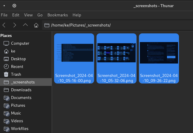
Unfortunately my favorite theme (and most themes?) affect the thumbnails by making it harder to see.
It darkens the thumbnails when selected so it becomes harder to tell them apart. 
The more alike (and dark) they are the worse it gets. (Just some random clipboard things there)
I have tried to tweak the them CSS, but with limited success.
I want to:
1. only affect the icon selection, ideally (not the tree view to the left)
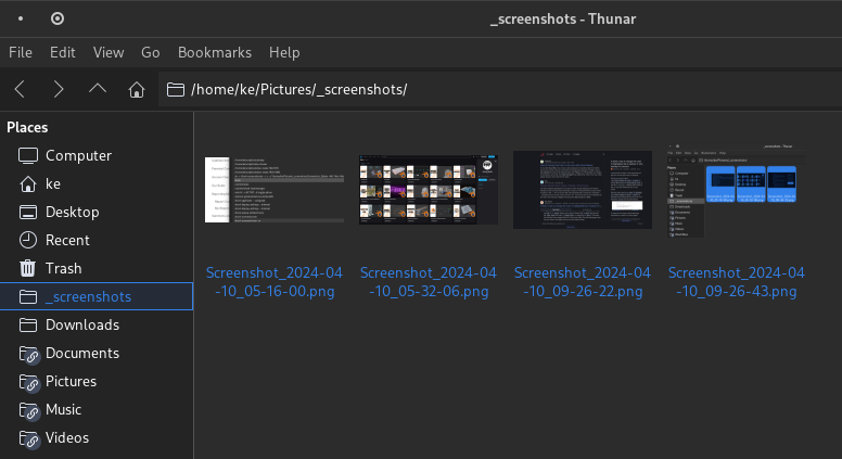
2. still have some selection highlighting (so i can clearly see what is selected: at least an outline, or ideally, the same thing, but without the darkening effect)
My attempt:
.thunar .view:selected {
  border: 1px solid #3281EA;
  background-color: transparent;
  color: #3281EA;
}
Any ideas?
^ - ^
Offline
#2 2024-04-10 12:19:57
- ToZ
- Administrator
- From: Canada
- Registered: 2011-06-02
- Posts: 12,500
Re: Thunar GTK CSS: icon selection coloring woes
Hello and welcome.
1. only affect the icon selection, ideally (not the tree view to the left)
Use the ".standard-view .view" class combination instead of just ".view".
2. still have some selection highlighting (so i can clearly see what is selected: at least an outline, or ideally, the same thing, but without the darkening effect)
This one is a little tougher as I don't think it can be directly targeted - it uses theme_selected_bg_color to colour that.
Mark solved threads as [SOLVED] to make it easier for others to find solutions.
--- How To Ask For Help | FAQ | Developer Wiki | Community | Contribute ---
Offline
#3 2024-04-10 13:06:24
- undercover_agent
- Member
- Registered: 2023-09-05
- Posts: 8
Re: Thunar GTK CSS: icon selection coloring woes
Thanks!
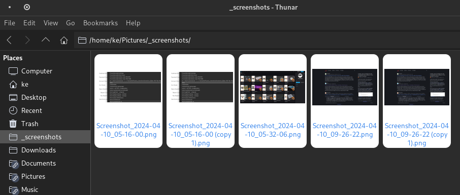
Yeah it seems to be a multiply effect, best I could do is make it white (= thumbnails are not affected)
unfortunately it is a bit much contrast wise...
I tried changing "background-blend-mode" but it did nothing. I will try to investigate theme_selected_bg_color later at some point. I doubt I can keep it white - as it is just a different flavor of annoying ;>
thanks though!
^ - ^
Offline
Pages: 1
- Registered users online in this topic: 0, guests: 0
[ Generated in 0.013 seconds, 9 queries executed - Memory usage: 517.11 KiB (Peak: 518.09 KiB) ]